
Every pomodoro timer I've ever used feels like a chore wearing a countdown clock. They work, technically - but they treat focus like punishment, all harsh alarms and sterile interfaces. I kept thinking: what if starting a focus session felt less like clocking in and more like powering on a Wii? That warm chime, the friendly bounce, the feeling that something fun is about to happen.
So I built Pomodorii - a sound-first pomodoro timer wrapped in Wii-era nostalgia, designed and developed end-to-end by me. It's shipped, it's open source, and real people use it every day.
The Design Challenge
On the surface, a pomodoro timer is one of the simplest products you can build: a countdown, a break, repeat. But I wanted to solve a more interesting problem - how do you make a productivity tool that people actually want to come back to?
That question opened up three design challenges I hadn't seen tackled well together:
Sound as primary interface. Most apps treat audio as an afterthought - a notification ping at best, an alarm at worst. I wanted sound to carry real UI weight. Could a user understand what's happening without even looking at the screen?
Nostalgia as design language. The Wii wasn't just a console - it was a vibe. Approachable, joyful, inclusive. That aesthetic communicates something specific: this isn't serious, and that's the point. Could I channel that feeling into a productivity tool without it becoming gimmicky?
Making productivity feel playful. There's a tension between "focus tool" and "fun experience." Lean too far toward fun and it's distracting. Lean too far toward utility and you're back to another forgettable timer. The sweet spot is where structure feels like play.
Sound Design: The Core of the Experience
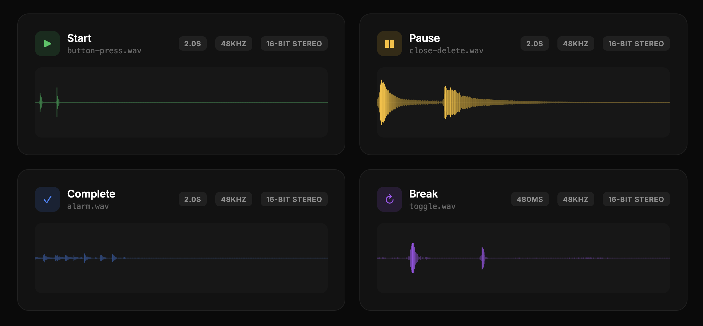
This is where I spent the most creative energy. I designed and produced every sound cue in Pomodorii from scratch - each one crafted to match the personality of the interaction it represents.
Every interaction has its own sonic signature. Picking up a task gets a soft, rising tone. Starting the timer triggers a melodic confirmation. Hovering over a close button plays a gentle warning note. The transitions between work and break sessions use layered chimes that ease you in rather than jarring you out of flow. There's even a Wii-inspired theme song that plays on load - because if you're going to commit to the bit, commit fully.
The philosophy behind the sound design is what I call "readable by ear." At any point during a session, the audio alone should tell you:
- Whether you're in a work session or break
- When a transition is coming
- What just happened (task completed, timer started, session ended)
This meant designing a consistent sonic vocabulary - rising tones for positive actions, softer descending tones for pauses, rhythmic patterns that create a sense of progression through the session. I produced each sound effect myself and composed the background theme music, giving the app a cohesive audio identity from the ground up.
Key Design Decisions
Why the Wii aesthetic?
It would've been easy to go minimal - another clean white timer with a sans-serif font. But I kept coming back to the question of emotional resonance. The Wii era represents something specific in design history: the moment a tech company proved that friendly beats powerful. Nintendo made a console your grandparents could use, and it outsold everything. That philosophy - warmth, accessibility, joy - maps perfectly onto a productivity tool that needs to lower the barrier to starting work, not raise it.
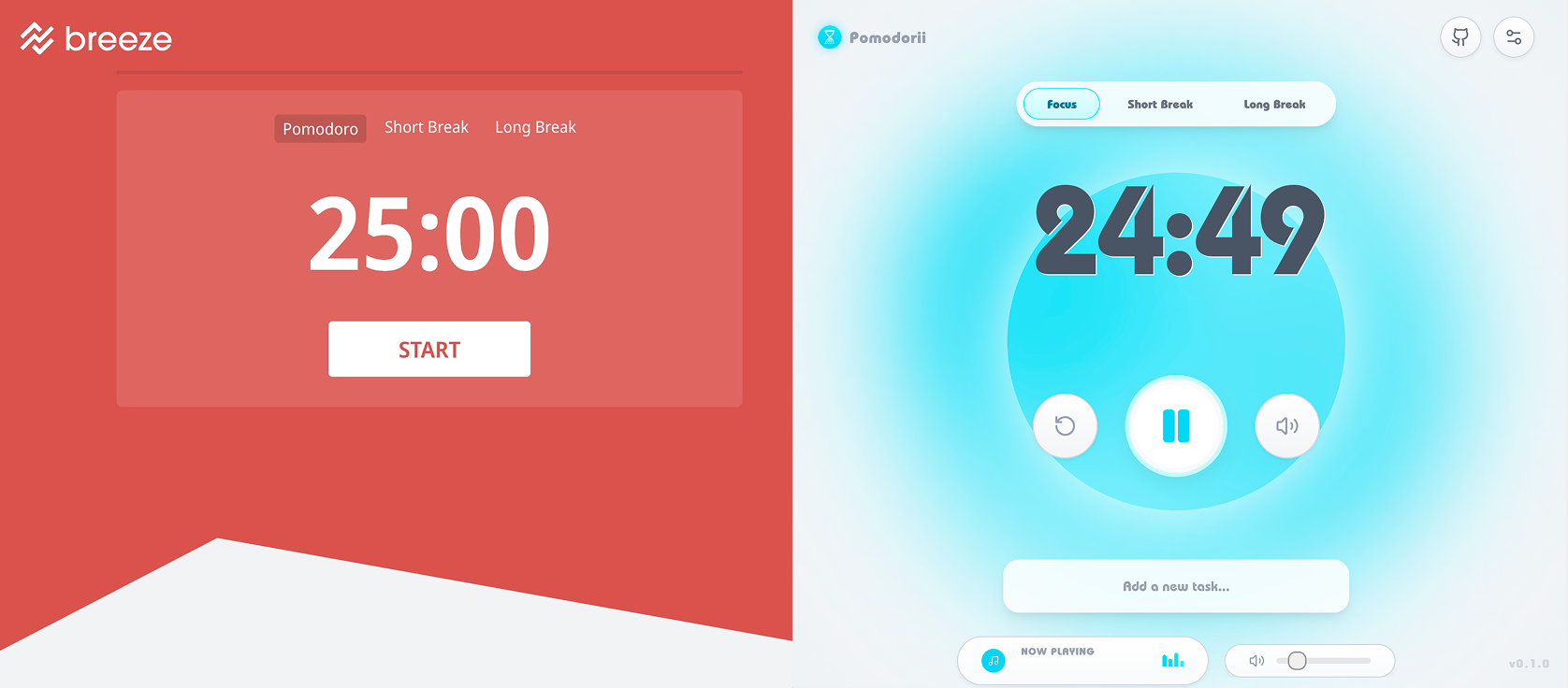
The rounded shapes, soft gradients, and bubbly motion language all come from that era. But it's not a Wii skin - it's the feeling of a Wii, translated into a web interface. Bright but not loud. Playful but not childish. Familiar but fresh.
Why sound-first?
Most productivity tools optimize for visual minimalism and ignore the other senses entirely. But when you're in a focus session, you're often not looking at the timer. You're heads-down in your work. Sound is the one channel that reaches you without demanding attention. By making sound the primary feedback mechanism, Pomodorii stays present without being intrusive.
This also made the timer more accessible - users who aren't watching the screen still get rich feedback about session state through audio cues alone.
Why a PWA?
Pomodorii ships as a lightweight Progressive Web App built with Next.js. No app store, no install friction, no updates to manage. Open the URL, start a session. It works offline, loads in under two seconds, and sits in your browser tab like a quiet companion. For a tool that lives alongside your actual work, minimizing friction was everything.
The tech stack - React, Tailwind CSS, Framer Motion - was chosen for speed of iteration and expressiveness. Framer Motion handles the bubbly, physics-based animations that give the UI its personality. Tailwind let me move fast on styling without fighting a design system. The Web Audio API handles background music playback with seamless looping and volume control.
Real-World Adoption
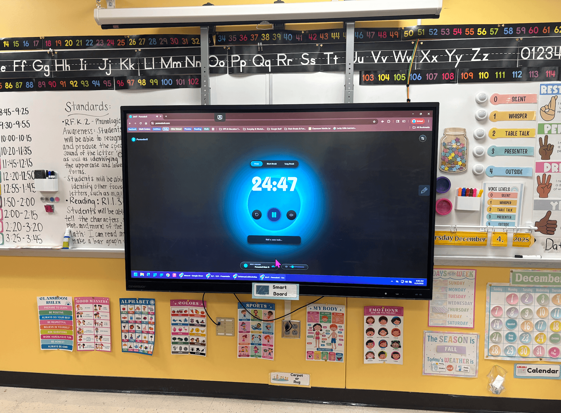
Here's where this project surprised me. Pomodorii quickly became a hit at the school where my partner teaches. She started using it in her classroom to structure focus time, and before long her colleagues were asking about it.
Teachers began adopting it for their own sessions - both personal productivity and classroom use. The feedback started flowing almost immediately: requests for longer break options, questions about customizing sounds, ideas for classroom-specific features like group timers. One teacher told my partner it was the first timer her students actually liked hearing go off.
Seeing a side project spread organically through word of mouth - no marketing, no launch strategy, just people showing other people something they enjoyed using - has been one of the most rewarding experiences of my career. It validated the core hypothesis: if a tool feels good to use, people will choose it over technically equivalent alternatives.
Outcome & Reflection
Pomodorii is live at pomodorii.com, open source, and actively used. It's a small product with a small audience, and I love that about it. Not everything needs to scale to millions - sometimes the right measure of success is a classroom full of kids who associate focus time with a friendly chime instead of a harsh buzzer.
What I learned building this:
- Sound is an underused design material. Audio design is barely explored in product design. There's a huge opportunity space in designing interfaces that communicate through sound, not just visuals.
- Emotional design isn't decoration. The Wii aesthetic isn't a skin - it's the reason people come back. The playfulness is functional. It lowers the activation energy to start working.
- Ship the thing that makes you smile. Pomodorii started as a sound design experiment with no roadmap. The best side projects are the ones where you follow curiosity and let the product reveal itself.