
The software displayed here, along with all related processes, is the intellectual property of RoveiQ. All designs, features, functionalities, and software processes are proprietary to RoveiQ and are protected under applicable intellectual property laws. Nothing in this showcase is outside of public knowledge, and no confidential customer data is shared.
The Biggest Thing I've Ever Shipped
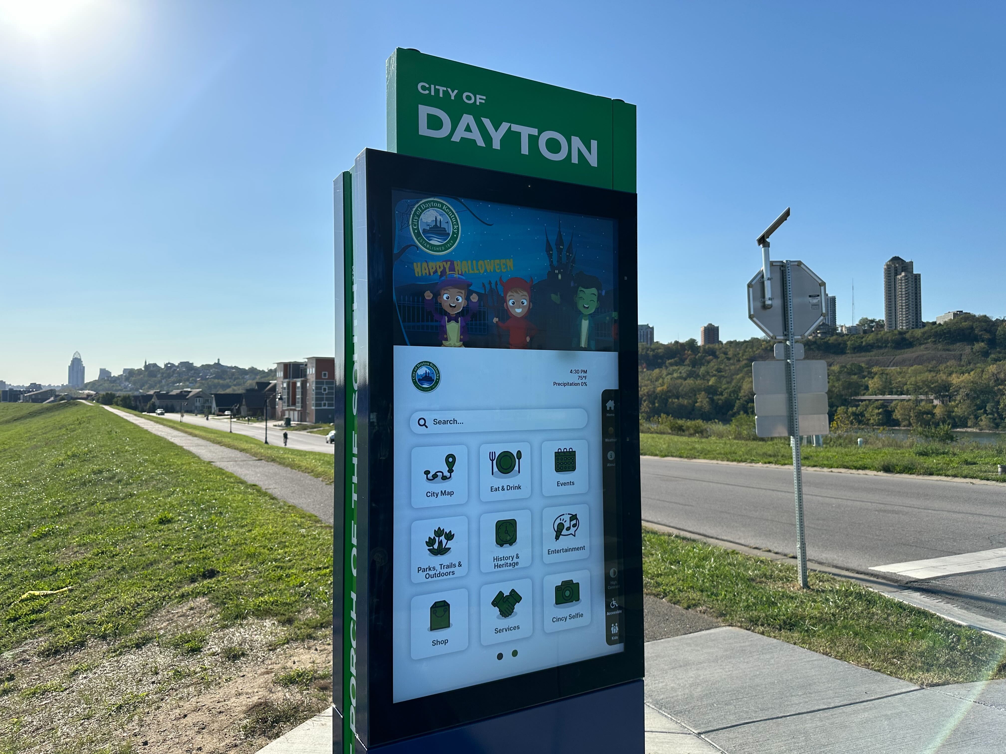
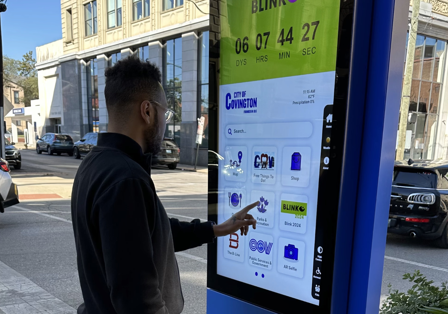
This was the project that changed how I think about design. The Smart Directory UI was a 55-inch outdoor touchscreen platform for cities - a digital hub for navigation, local services, events, and community engagement, deployed in real urban environments where thousands of people would interact with it every day.
It was also the biggest project I'd ever taken from concept to market. Not a feature within someone else's product. Not a redesign of an existing flow. A full platform, from first wireframe to deployed hardware, with every design decision running through me.
What Made This Hard
Designing for a 55-Inch Outdoor Touchscreen
This isn't a phone. It's not a tablet. It's a five-foot-tall screen standing on a sidewalk in direct sunlight, rain, and every lighting condition in between. The interface had to dynamically adjust to outdoor conditions while remaining legible and usable at all times.
Touch targets needed to accommodate every hand size and reach height. Typography had to be readable from multiple distances - a person standing directly in front of the screen, someone approaching from ten feet away, a user in a wheelchair. Every pixel decision carried physical-world consequences that you never think about when designing for phones.
Inclusivity and Accessibility at Scale
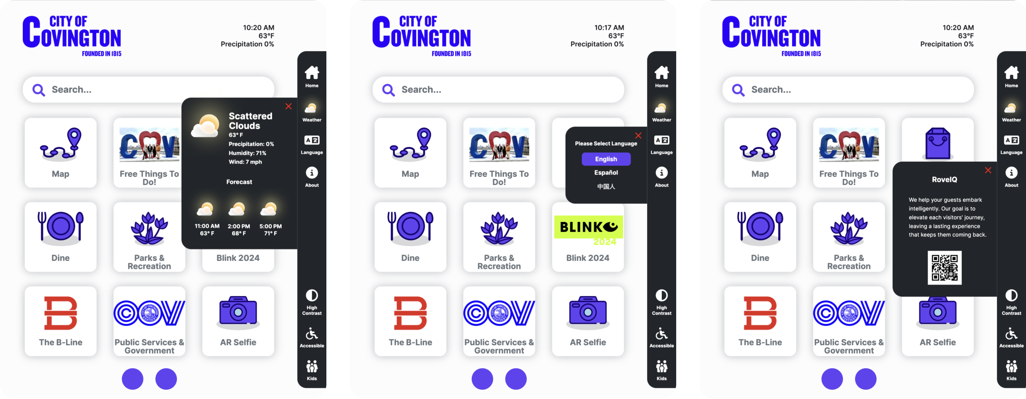
This wasn't an app with an accessibility checklist - it was public infrastructure. The people using these kiosks included tourists who don't speak English, elderly residents navigating unfamiliar technology, wheelchair users, and kids. The interface needed AI-powered multilingual support and full ADA compliance, not as features but as foundational requirements. Designing for the broadest possible human range, in a public setting, raised the bar on every interaction pattern I chose.
Stakeholder Navigation Across Cities
Every city deployment brought a new constellation of stakeholders. Private entities managing local press. City employees overseeing public information. Tourism boards. Emergency services. Each group had opinions on what content should appear, how it should be prioritized, and what the interface should emphasize.
The challenge wasn't just accommodating these voices - it was building a system flexible enough to let cities customize their experience while maintaining design integrity. Stakeholders sometimes made decisions that contradicted our recommendations. The interface had to look polished regardless, absorbing those choices without breaking. This required designing a system, not just a screen - a flexible architecture where customization was a feature, not a compromise.
The Solution
A Modular, Adaptive Platform
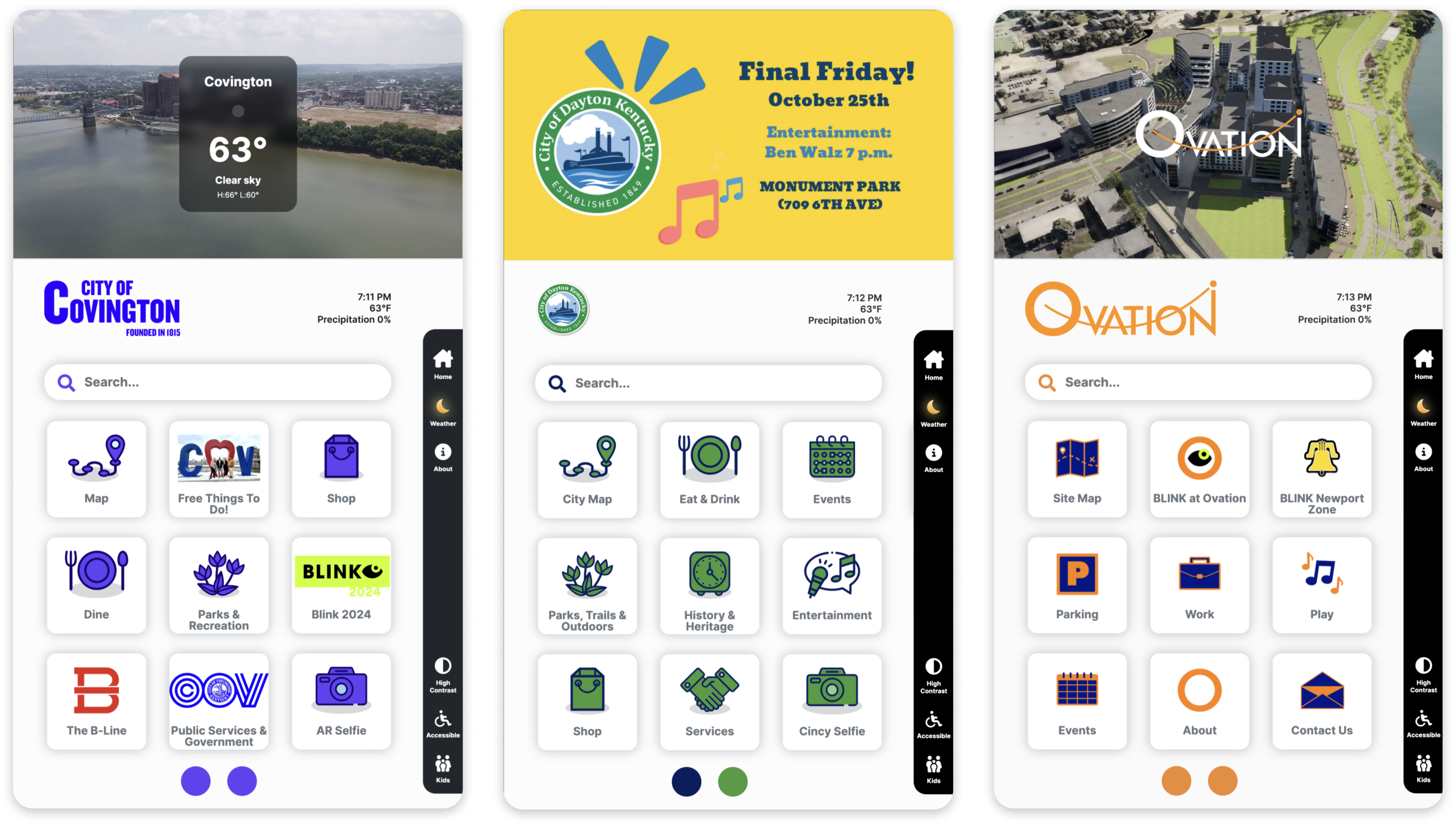
The final Smart Directory UI is a highly responsive platform with an interactive map interface and customizable app pages. It provides easy access to local services, events, and emergency information - and it works for everyone, regardless of ability, language, or familiarity with technology.
Customizable Branding and Apps
The system I designed lets cities personalize the UI with their own branding, colors, and app selection - all managed through an easy-to-use CMS. This was critical for adoption: cities needed to feel ownership over their kiosks without needing a design team to make changes.
Utilities for Enhanced User Experience
Real-time weather updates, a multi-language selector for broad accessibility, and a customizable "About" widget that allows cities to share important information and showcase local highlights. These utilities seem simple, but each one required careful consideration of how it behaves on a public screen in varying conditions.
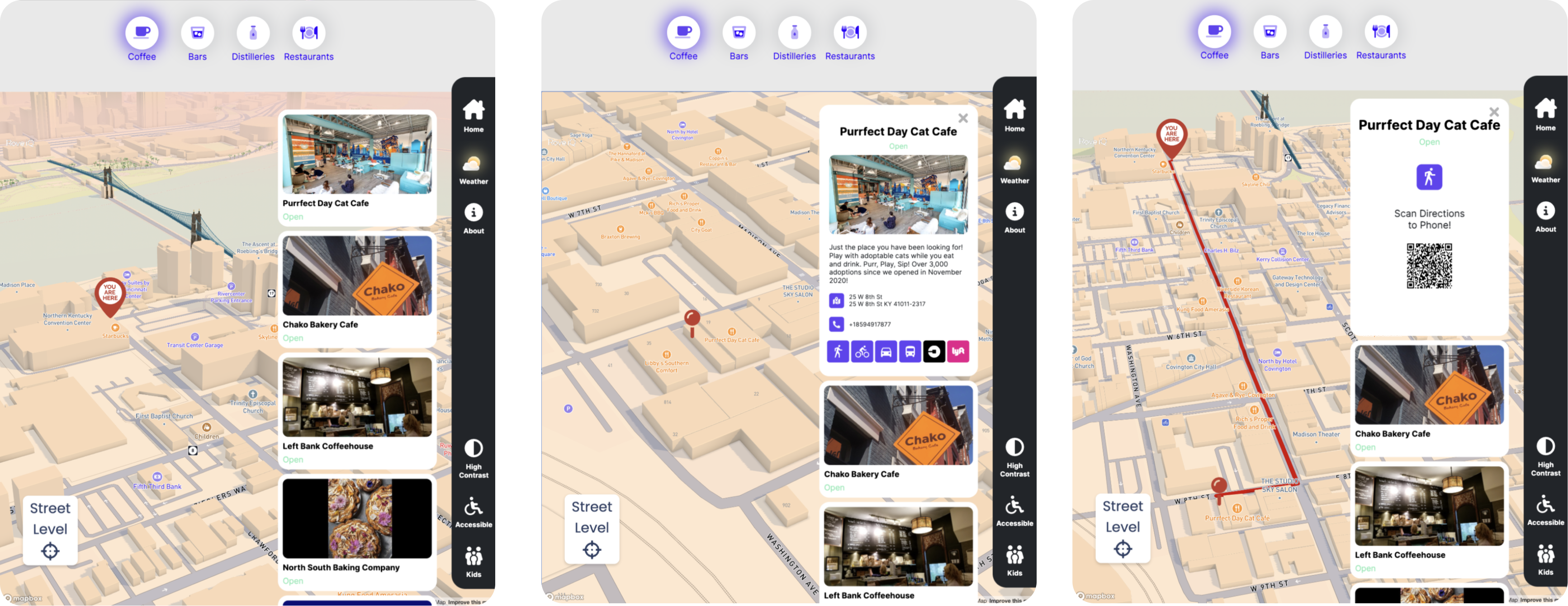
City Navigation and Points of Interest
The navigation app was the centerpiece - a detailed city map with unique Points of Interest, search functionality, and turn-by-turn directions. Walking, driving, public transit, and biking options, plus integration with ride-sharing services like Uber and Lyft. The goal was comprehensive routing that meets people where they are, however they move through a city.
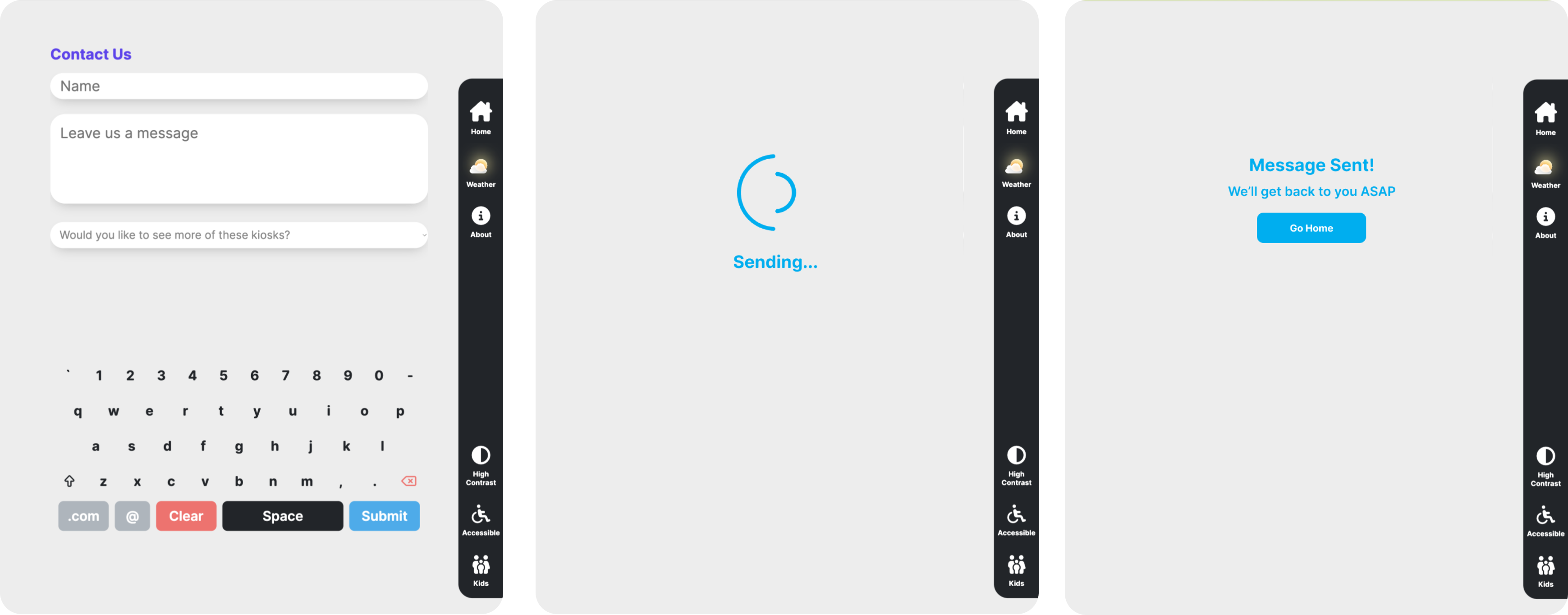
Direct Communication with City Services
An integrated contact form lets users report issues, share feedback, or reach out directly to city representatives. This feature turned the kiosk from a passive information display into an active civic engagement tool - a two-way channel between cities and the people in them.
Augmented Reality Selfie Experience
The AR Selfie app lets users capture and share unique memories during their visit, adding interactive augmented reality elements to photos. It's a playful feature in an otherwise utilitarian product - and that contrast is deliberate. Public infrastructure doesn't have to feel like public infrastructure.

How I Grew Through This Project
More than the shipped product, this project shaped who I am as a designer. I'm sharing what I learned because the honest lessons are more valuable than a polished highlight reel.
Don't reinvent the wheel - stand on it
In the early stages, I explored countless directions trying to find the right solution. I spent too long trying to reinvent kiosk software from scratch, looking past decades of research that already existed in the space. The breakthrough came when I stopped trying to be original and started being informed. The best design decisions came from deeply understanding existing patterns and then knowing exactly where to push beyond them.
Seek feedback relentlessly - especially when it's uncomfortable
From catching mistakes in my own UI to uncovering deeper foundational UX problems in the software, I'm grateful that I constantly asked for feedback from my peers and from my mentor Russ. He coached me through the moments when I felt stuck or hit a wall, and those conversations were often more valuable than any design sprint. Learning to invite critique - and to sit with it long enough to actually learn from it - was the most important skill I developed on this project.
Protect the user, even from the stakeholders
When stakeholders made requests that would have compromised usability, I had to learn how to push back with evidence and empathy rather than ego. I didn't always win those conversations. But I always made the case, and I got better at it over time. The interface had to serve the people standing in front of it, not just the people signing the contracts.
Reflection
Taking a product from concept to market - across multiple cities, stakeholder groups, and physical environments - taught me things that no amount of UI work on existing products could have. I learned to navigate ambiguity, defend design decisions under pressure, and build systems that flex without breaking.
I'm immensely grateful for Russ's mentorship and for the team at RoveIQ who trusted me with this scope. This project proved to me that I can lead design at the platform level, not just the feature level - and that the messy, political, human side of product work is where the most important design happens.